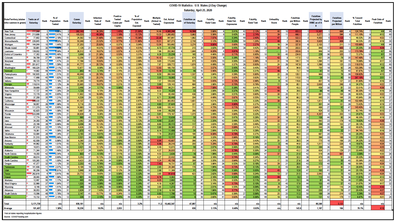
HSP compiled the following COVID-19 Statistics for U.S. States and Territories (sorted by cases per million people). This data stands as of Saturday, April 25, 2020.
Scroll down to download this excerpt from HSP’s database.
I’m updating state data tonight with some new estimates of total exposures. I’m also highlighting how real data continues to confound the estimates of even the best models (the IHME).
First on testing: we have surpassed 5 million test results nationwide (that equates to about 1.58% of the population) with 930,000 confirmed cases. Most tests per capita are Rhode Island (4.8%) and New York (4%). Arizona, Texas, Virginia and Kansas have tested the smallest portion of their population (under 1%). We have a few states testing a larger portion of their population and with very few relative cases and fatalities, so they are going to be good to watch. Seems like they are ahead of the game and will have better data from which to make decisions (Utah, Tennessee, Alaska, Hawaii, North Dakota).
In terms of infection positive rate as a % of those tested, New Jersey is by far having problems….50% are testing positive. This indicates they are still very much behind the infection curve and struggling to catch up. The national average is 18% positive of those tested. 26 states have a positive vs. test rate of 10% or less. Alaska and Hawaii are only getting 2.15% positive tests back, indicating a very minimal issue and compared with their testing of about 2% of their total populations, suggests that they should be able to isolate and contact trace without too much problem.
Other states with high positive test results relative to number of tests include the usual Northeastern areas: NY, CT, DC, MA, PA and DE; Midwestern hotspots Michigan and Illinois and one interesting outlier out west: Colorado. All are getting 20%-36% positive test results.
The positive infection rate per capita is only reported at 0.28% at this time, led by 1.45% in New York and as low as 0.04% in Montana and Hawaii. However, and here is the updated headline about estimated exposures. We have some preliminary data from New York City that 21% of the population tested positive for antibodies, suggesting much wider exposure by a factor of approximately 14.5x….if we can extend that NYC figure to NY State (we can’t, but it’s all we have). BTW, this 14.5x rate compares to the two west coast studies suggesting 50 – 80x more infections than positive test results. For now I’m going with the lower end of the spectrum, but also believe it could be much higher.
IF this 14.5x infection and exposure rate is accurate, it would suggest that there a lot of asymptomatic infections. In total, my estimate is that about 4 million New Yorkers have been exposed. It also then suggests the fatality rate is 0.41%, which is about 4x deadlier than the annual flu (but much more variable, tricky, unpredictable and contagious). But for people worried that the fatality rate is 4-5%, it does not appear to be correct. That is only the fatality rate of the positive case tests. Once you add in all the others who have been exposed but did not suffer enough to be tested or seek medical help, the situation improves, at least mathematically.
It does not help the nearly 50,000 people who have tragically died to date. But it also means a healthy person’s odds are pretty good of being exposed and surviving. Still not a good situation for those with existing conditions. The data I posted yesterday suggests that only 1% of the fatalities had no underlying health conditions.
Now, given the new data I’ve been collecting, I attempted to estimate the number of exposures in each state, based on data for each state regarding their infection rates, overall health index, fatalities, etc. I then totaled the estimated total exposures and came up with 10.4 million, or about 11.2x the current positive case number. Now this is only about 3.2% of the population and so if herd immunity is going to happen, it could take a long time at this rate, but it also means we have kept the contagion at bay by generally staying home.
If we go to the other end of the antibody testing spectrum (where some estimated 80x more infections than recorded), some might say that nearly 75 million Americans have been exposed, which is 23% of the population. I wish that were the case, because then we would be much closer to the other side. No one knows for sure yet. We do know that NY/NJ appear to have the highest exposure rates. Jury is still out on all of this, but the more we test the more we understand.
Also, I took down all the IHME estimates from a couple of weeks ago about the peak date of infection and the total number of fatalities through August 4th. Turns out they have already been wildly incorrect! They have both underestimated deaths in most of the northeastern states and overestimated in most other places (so far). For example, their model predicted only 39 deaths for Delaware, but they have already tripled that number. In fact, there are 11 states that have already surpassed the IHME’s estimate of total deaths for the next three months….today. So where they were off, they were really off, typically in the hardest hit states.
However, there are another 14 states at the other end of the spectrum, with less than 25 percent of total expected deaths having occurred already. We are rooting for all states to underperform the estimates, which continue to change every few days.
As of now, the estimate is for just under 70,000 deaths through August 4th, which means we are 70% of the way there. I have a feeling that the fatality figure will be higher, but also that the overall infections and fatality rates will be more favorable in the end. Bad news/good news.
This virus is much harder to wrangle than hoped and as most of us know, there have been outbreaks in two critical places: nursing homes and now factories/food plants. Both had many people in close quarters. The “essential” production workforces are sadly getting quickly infected, but hopefully will have a strong survival rate. The nursing homes, sadly will not fare as well and can completely change the fatality totals in a state. In Europe, the percentage of fatalities from nursing homes has been up to 50% of the total, while here in the U.S., the nursing home rate appears closer to 25%.
If we are 70% percent though the fatalities (or even if we are just halfway done), that feels like a hopeful sign. I think a lot of people are looking for hope, realizing there are so many unknowns out there. Our leaders, for better and for worse, are doing as expected (better/worse). Some days it feels like the blind leading the blind and everyone is working through it in their own way. I feel really badly for those suffering and those who are alone and lonely. Many of us are lucky to be surrounded by at least one person (and pets) who can stand to be around us for 2 months nonstop.
For Hunden Partners, governments and companies hire us to figure out as much data as possible and point them in a direction. I always say that “we can never have perfect data, but we will have more than anyone else” and then we can make the best decision possible without being frozen in fear. We cannot let the perfect be the enemy of the good and have analysis paralysis. You gather as much data as quickly as possible and make course corrections as you go, limiting risk and cost along the way to maximize results.


