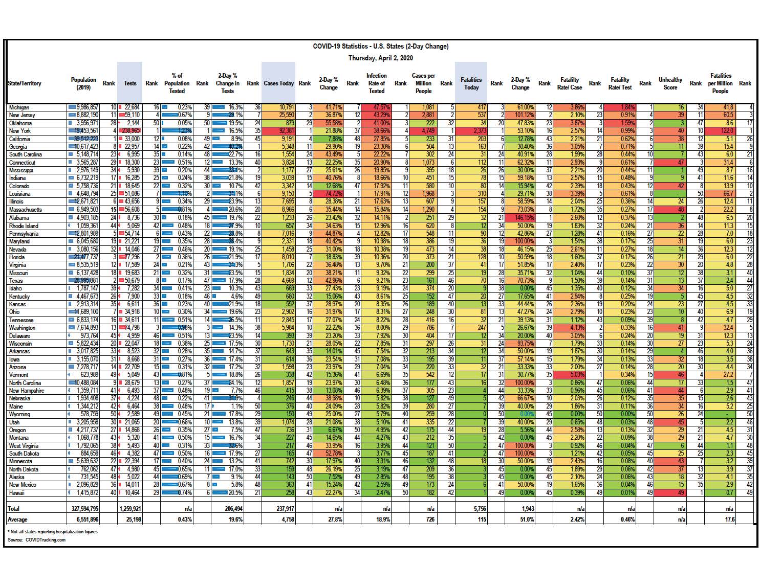
HSP compiled the following COVID-19 Statistics for U.S. States and Territories (sorted by cases per million people). This data stands as of Thursday, April 2, 2020.
Scroll down to download this excerpt from HSP’s database.
Alright, it’s been two days since I posted updated state by state metrics, but I do feel that two-day spans are often more instructive than one-day changes (plus I can get more sleep!).
Purpose. Overall, I’ve been trying to use the data to help figure out how to think about the virus, our future, our response (as individuals and governments) and instruct us moving forward. The goal is as little destruction as possible (both in lives and livelihoods). We can’t have perfect health and no commerce, nor perfect commerce and no health. But where we place the fulcrum on the balance is the tricky part. Sadly, we just do NOT have the data yet to determine where that balance should be. But the experience of Iceland (I told you they’d be back tonight) can be very instructive.
Why Iceland? Because instead of only testing people with symptoms, they conducted randomized tests across the whole population. And they tested (so far) at least 5% of their population (which is easy to do when you have 360,000 people, about the size of metro Evansville, IN). And a 5% testing rate is nearly 12x higher than the U.S. at this point. We have not even been able to keep up with those with symptoms, let along random screenings (we are nearly 1000x more populous, so we have a lot of testing to do and are finally catching up by about 100k tests per day).
What did the results in Iceland show? That WAY more people are/were infected per capita than in any other country in the world other than Luxembourg (about 6x higher than reported US infection rate). At first, this is super alarming, right? It means that, well crap, way more people in the world are likely infected than we thought. But wait, is that so bad? No. Why? Because what it shows is that the denominator is also WAY bigger than we thought. And if that is the case, then it means that the hospitalization and fatality rate is much lower than previously thought. Instead of 2-4% fatality rate per infection, it could be less than 0.5%. In fact, in Iceland (which is a remarkably healthy place anyway), they have had only 2 fatalities out of 1,220 infections, or a death rate of 0.16%. This is about 60% higher than the seasonal flu death rate of 0.1%. However, b/c it is so contagious AND we don’t understand how/why it impacts some seemingly healthy people just as badly as those with underlying health issues, the randomness and severity of the disease is what is paralyzing the world in place.
Yet Iceland has not instituted a lockdown and does not intend to. They just track and isolate as people test positive. Because they tested early and so widespread, they had better data. We are still playing catch up and will be for awhile. At our current rate of 100k tests per day, we wouldn’t be at 5% testing for another five months. Of course we know that the rapid test is being distributed and that will be an exponential game changer. It is being considered where to send these machines first. One strongly considered concept is to send a good chunk to the least infected states, at least based on known data, in order to repeat the Icelandic model.
One thing you will note in how I sorted my metrics tonight is the inverse correlation between % of population tested and % of tests that are positive. That means that the smaller the portion of a state’s population that has been test, the higher the rate of infection of those that were tested. The data clearly show the states that are not able to keep up testing and so only the most severe/obvious cases are getting tested. California has been a crazy outlier since the beginning. they are the most populous state (as populous as all of Canada) and yet have nearly the lowest test results rate of any state at 0.08%. As a result, nearly 30% of tests come back positive. The rates are even worse for Michigan, NJ, Oklahoma and NY. We know NY/NJ are massive hotspots and they HAVE tested more per capita than other states. But Calif, Michigan and Oklahoma have not tested and are seeing these huge numbers. Either way, this is where we show the strain in the system.
On the opposite end of the spectrum, the rate of testing is higher in the states with low infection rates per test. Not surprisingly, the infection and fatality rates are mostly the lowest in places that have strong health scores (Hawaii, Utah, Minnesota, Alaska, the Dakotas).
So when we look back on this in a year and have tons of data, we will know a lot more. The randomness, the contagiousness, who is truly at risk and how it’s caught (and does the type of exposure correlate to severity) will allow us to know a lot. When the next wave comes, will we need to shut down the economy? or just wear masks, isolate those we know are at risk and keep working? Plus, we will likely have a number of treatments by then to mitigate the severity. My guess is we will find a way to move on without risking the health of everyone and destroying the economy. At least that is my hope. I have faith that the evidence and the science will lead us out of this, and likely sooner than we fear!
Have a look at the numbers, attached. Let me know if you want me to post it in any other “sorting”. One is sorted by infection rate per test, while the other is sorted by % of population tested (smallest to largest). I generally feel good when a state has tested a ton of people and has low infection and fatality rates. Hawaii and Utah are my winners (so far!). They are also really healthy states.
Pray for our scientists. We need them to win! Maybe after this is all over, more people will study science….or become AI experts and help science solve this….or both.


